
Numbers have a unique ability to convey complex ideas in a straightforward manner. They can transform abstract concepts into tangible evidence, making them essential for impact reporting.
When you present data effectively, it can resonate with your audience, whether they are stakeholders, donors, or the general public.
For instance, a nonprofit organization might report that it has provided clean water to 10,000 people. This figure doesn’t just represent a number; it signifies lives changed, health improved, and communities revitalized. The power of numbers lies in their capacity to tell a story that is both compelling and credible.
However, numbers alone can be misleading if not contextualized properly. A statistic like “10,000 people served” can sound impressive, but without additional context—such as the challenges faced or the resources required—it risks becoming just another figure lost in a sea of data. To truly harness the power of numbers, organizations must ensure that they are not only accurate but also relevant and relatable.
By weaving these statistics into a broader narrative, you can create a more profound impact that resonates with your audience on an emotional level.
Crafting Compelling Narratives: The Art of Storytelling in Impact Reporting
Storytelling is an age-old tradition that transcends cultures and generations. It’s how we connect with one another, share experiences, and make sense of the world around us. In the realm of impact reporting, storytelling becomes a powerful tool to humanize data and statistics.
When you tell a story about the people behind the numbers, you create an emotional connection that can inspire action and support. For example, instead of merely stating that your organization has provided educational resources to underprivileged children, share the story of a specific child whose life was transformed by those resources. This personal touch can make your impact more relatable and memorable.
Moreover, effective storytelling in impact reporting requires a clear structure. A well-crafted narrative typically includes a beginning, middle, and end. Start by setting the scene—introduce the problem or challenge your organization is addressing.
Then, move into the action—describe the initiatives you’ve implemented and the data that supports your efforts.
Finally, conclude with the outcomes—highlight the positive changes that have occurred as a result of your work. This narrative arc not only engages your audience but also provides a framework for understanding your impact in a meaningful way.
Choosing the Right Tool: Comparing Piktochart and Adobe for Impact Reporting

Simplicity and cost vs. steep learning curve and expense
When it comes to creating visually appealing impact reports, choosing the right tool can make all the difference. Two popular options are Piktochart and Adobe Creative Suite. Piktochart is known for its user-friendly interface and accessibility, making it an excellent choice for those who may not have extensive design experience. Piktochart also offers a reduced yearly fee for NGOs/NPOs who can demonstrate eligibility. Adobe offers an NGO discount but off of a much higher monthly fee.
With its drag-and-drop features and pre-designed templates, users can quickly create infographics and reports that effectively communicate their data without getting bogged down in technical details. On the other hand, Adobe Creative Suite offers a more robust if complicated set of tools for those who are comfortable with graphic design. Programs like Adobe Illustrator and InDesign provide advanced capabilities for creating custom visuals and layouts.
While this option may require a steeper learning curve, it allows for greater creative freedom and precision in design. Ultimately, the choice between Piktochart and Adobe depends on your specific needs and skill level. If you’re looking for simplicity and speed, Piktochart might be your best bet. Adobe is complex, expensive and takes time to learn.
However, if you want to push the boundaries of design and have the expertise to do so, Adobe could be worth the investment.
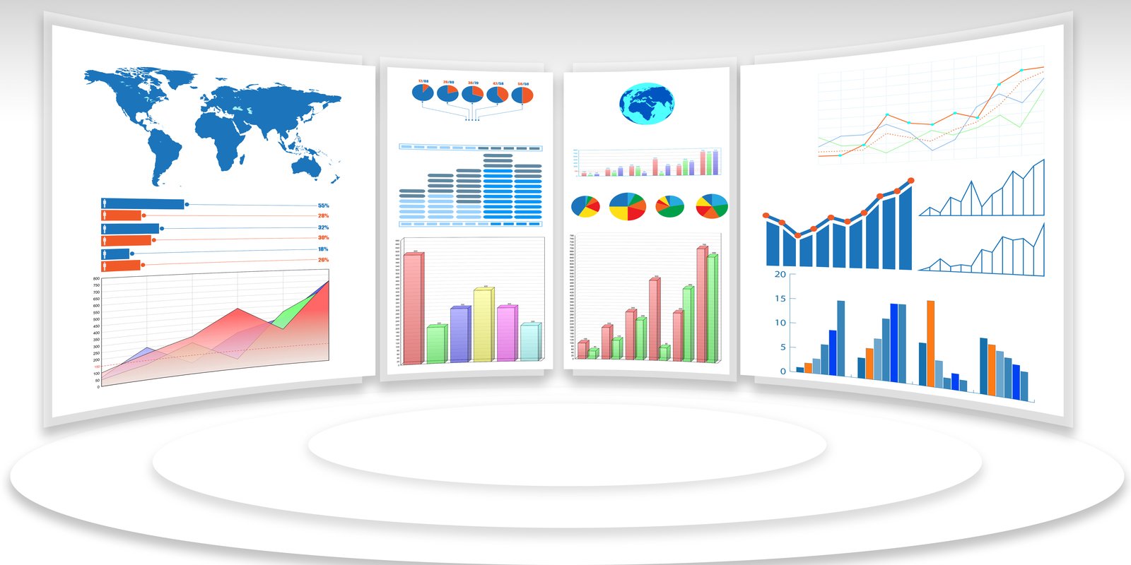
Infographics: Visualizing Your Impact Data for Maximum Effect
Infographics are an excellent way to present complex data in an easily digestible format. They combine visuals with text to create a narrative that guides the viewer through your information seamlessly. In impact reporting, infographics can highlight key statistics, showcase success stories, and illustrate trends over time—all while keeping your audience engaged.
For instance, an infographic could depict the growth of your organization’s outreach efforts over several years, using charts and icons to represent milestones along the way. The effectiveness of infographics lies in their ability to simplify information without sacrificing depth. By using colors, shapes, and images strategically, you can draw attention to critical data points while making the overall report visually appealing.
However, it’s essential to strike a balance; too much information or overly complex designs can overwhelm viewers rather than inform them. Aim for clarity and focus on the most impactful elements of your story to ensure that your audience walks away with a clear understanding of your organization’s achievements.
Case Studies: Bringing Your Impact to Life Through Real Stories
Case studies serve as powerful testimonials to your organization’s impact by providing real-life examples of how your work has made a difference. They allow you to showcase specific projects or initiatives in detail, illustrating not only what was done but also how it affected individuals or communities. For instance, if your organization runs a job training program, a case study could follow one participant’s journey from unemployment to securing stable employment through your services.
This narrative not only highlights your program’s effectiveness but also personalizes the data by putting a face to the numbers. In crafting case studies, it’s crucial to include both qualitative and quantitative data. While personal stories add emotional weight, statistics can provide context and credibility.
For example, alongside a participant’s story, you might include data on job placement rates or average salary increases post-training. This combination creates a well-rounded picture of your impact that appeals to both heart and mind—an essential aspect of effective impact reporting.
The Importance of Context: How to Frame Your Impact Numbers
Infographics represent a chance to not only promote your brand but to tell a story
Context is everything when it comes to interpreting data accurately. Numbers without context can lead to misunderstandings or misinterpretations that undermine your message. For example, stating that you’ve increased donations by 50% sounds impressive until you reveal that last year’s donations were exceptionally low due to unforeseen circumstances.
Providing context helps your audience understand not just what happened but why it matters. When framing your impact numbers, consider including comparisons or benchmarks that provide additional insight. For instance, if you report that you’ve served 5,000 meals this year, compare that figure to previous years or industry standards to illustrate growth or success more effectively.
Additionally, consider incorporating qualitative data—such as testimonials or feedback from beneficiaries—to enrich the narrative around your numbers. This holistic approach ensures that your audience grasps the full significance of your achievements.
Tips for Effective Impact Reporting: Best Practices for Numbers and Narratives
Creating an effective impact report requires careful planning and execution. Start by defining your objectives: What do you want to communicate? Who is your target audience? Once you have clarity on these points, gather relevant data and stories that align with your goals. Remember to keep your audience in mind throughout the process; tailor your language and visuals to resonate with them. Another best practice is to maintain transparency in your reporting. Be honest about both successes and challenges; acknowledging areas for improvement can enhance your credibility and foster trust with stakeholders. Additionally, consider using visuals strategically—graphs, charts, and images can break up text-heavy sections and make complex information more accessible. Finally, don’t forget to include a call to action at the end of your report; encourage readers to get involved or support your mission in some way.
Measuring Success: Using Data and Stories to Demonstrate Your Impact
Measuring success in impact reporting involves more than just crunching numbers; it requires integrating both quantitative data and qualitative narratives into a cohesive picture of your organization’s achievements. Start by identifying key performance indicators (KPIs) that align with your mission—these could include metrics like service delivery rates or community engagement levels. Regularly track these indicators over time to assess progress and identify trends.
However, numbers alone don’t tell the whole story. Pairing quantitative data with qualitative insights—such as personal testimonials or case studies—provides a richer understanding of your impact. For example, while you might report that 1,000 families received assistance this year, sharing individual stories about how that assistance changed lives adds depth and meaning to those figures.
By combining data with narratives, you create a compelling case for support that resonates with stakeholders on multiple levels. In conclusion, effective impact reporting hinges on the interplay between numbers and narratives. By harnessing the power of data while crafting compelling stories around it, organizations can communicate their achievements in ways that inspire action and foster deeper connections with their audiences.
Whether through infographics or case studies, the goal remains the same: to illuminate the real-world impact of our efforts and encourage continued support for our missions.